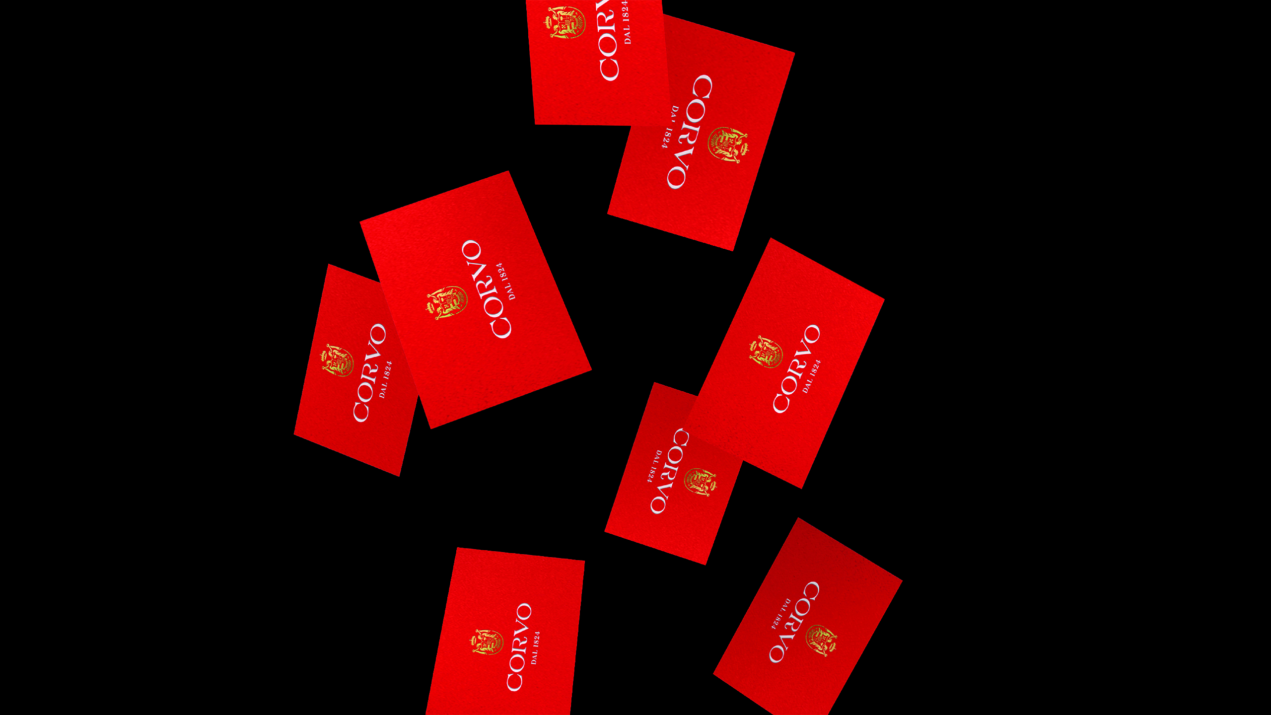
Corvo is a historic Sicilian wine, established in 1824. Our studio redesigned the company’s visual identity, aligning it with the core values of “taste the past, toast to the future.” The goal was to draw from the graphic elements that have historically characterized these wines, while introducing a fresh and youthful interpretation.
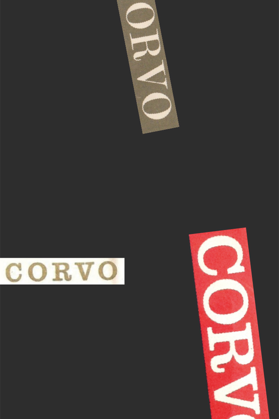
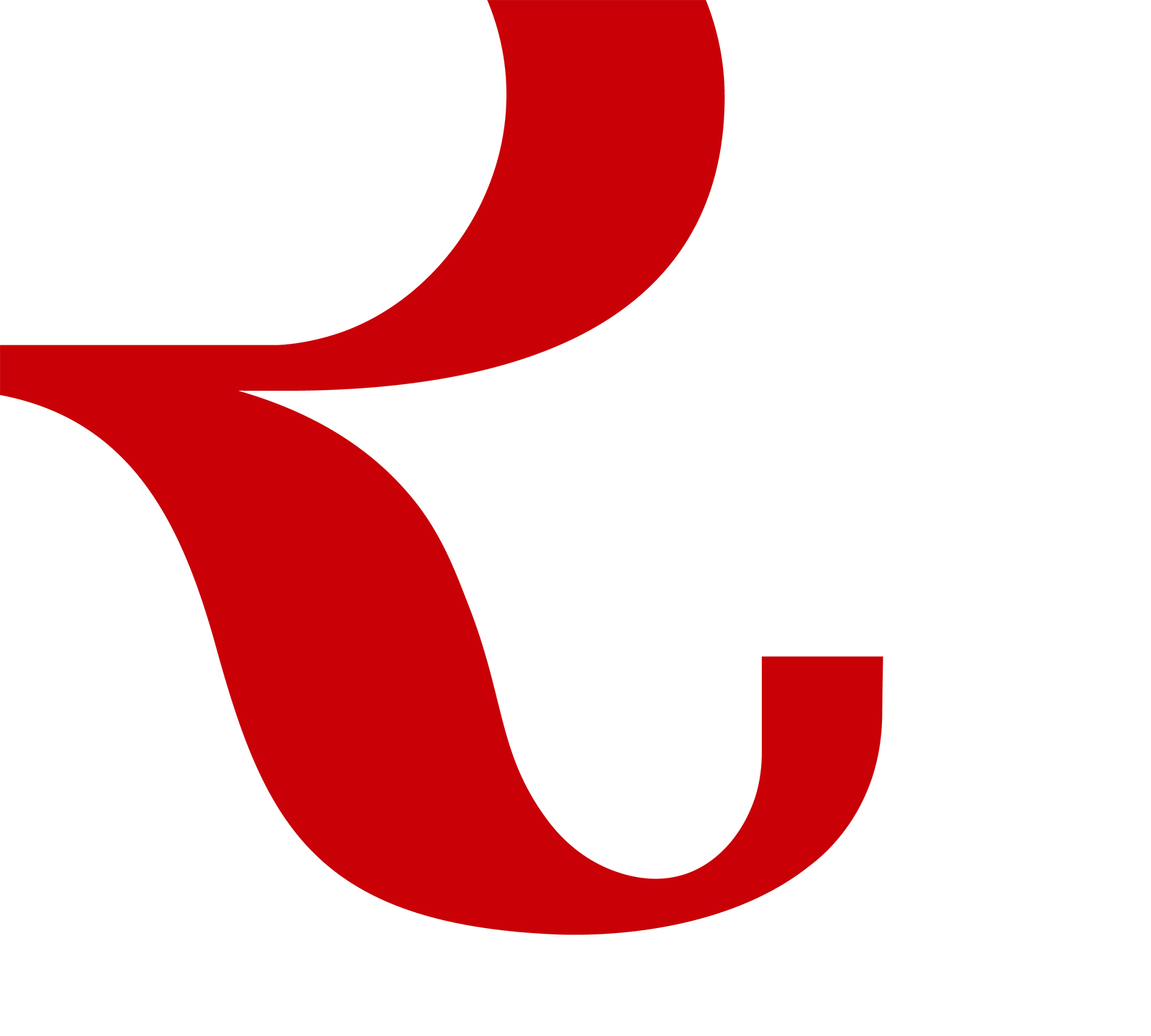
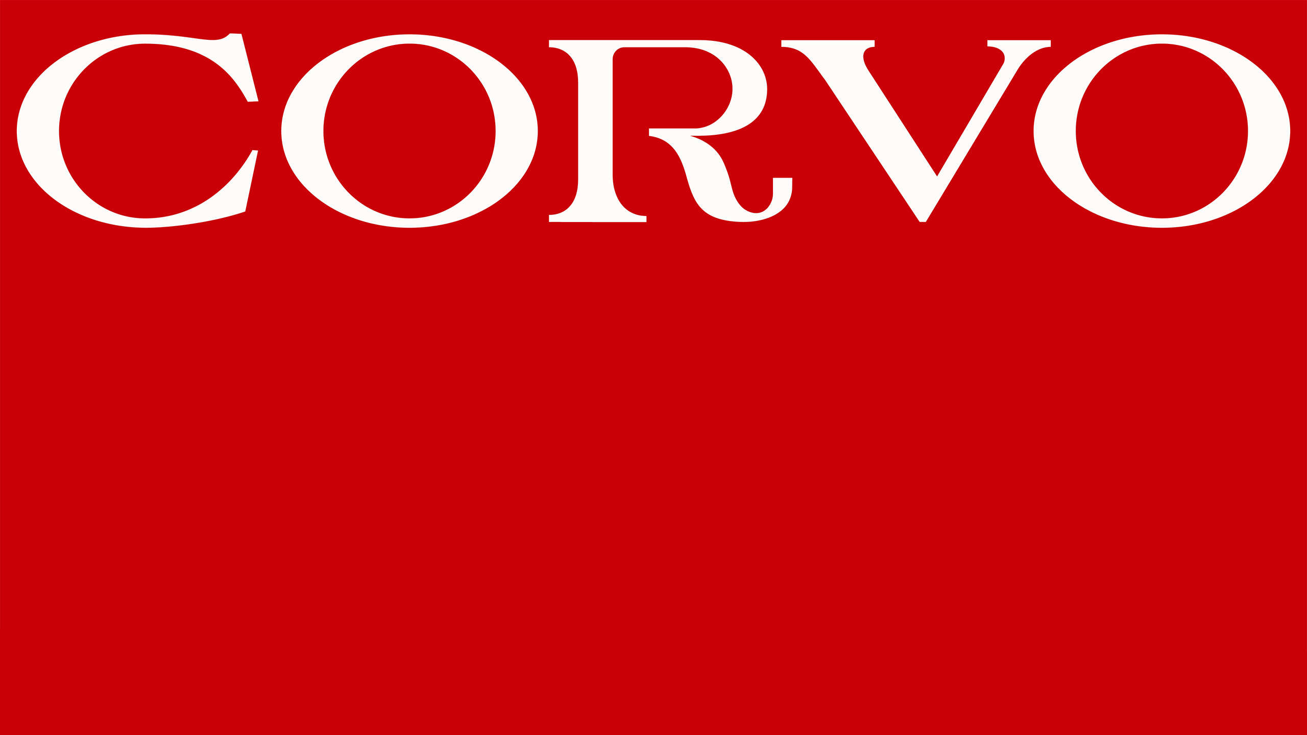
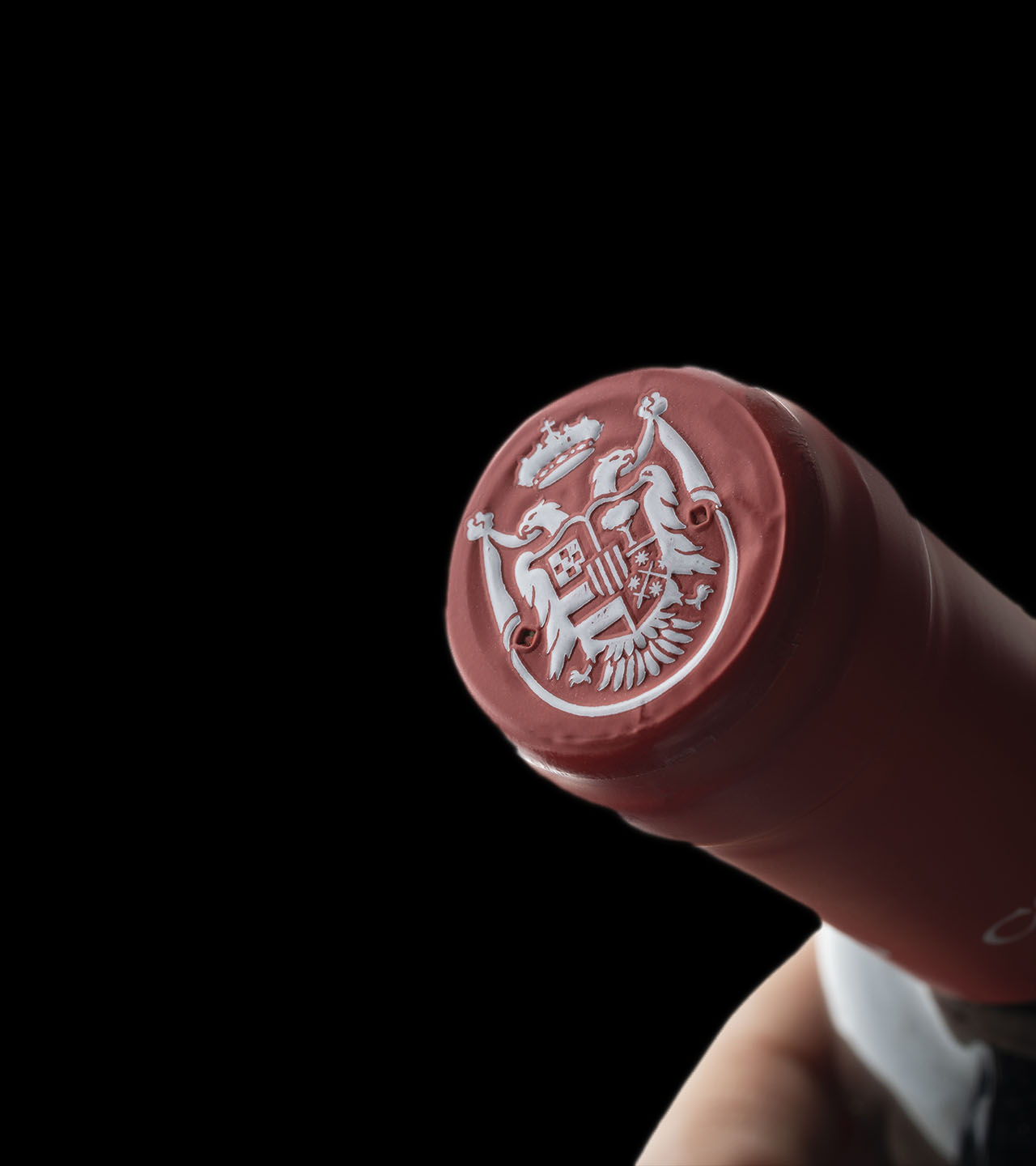
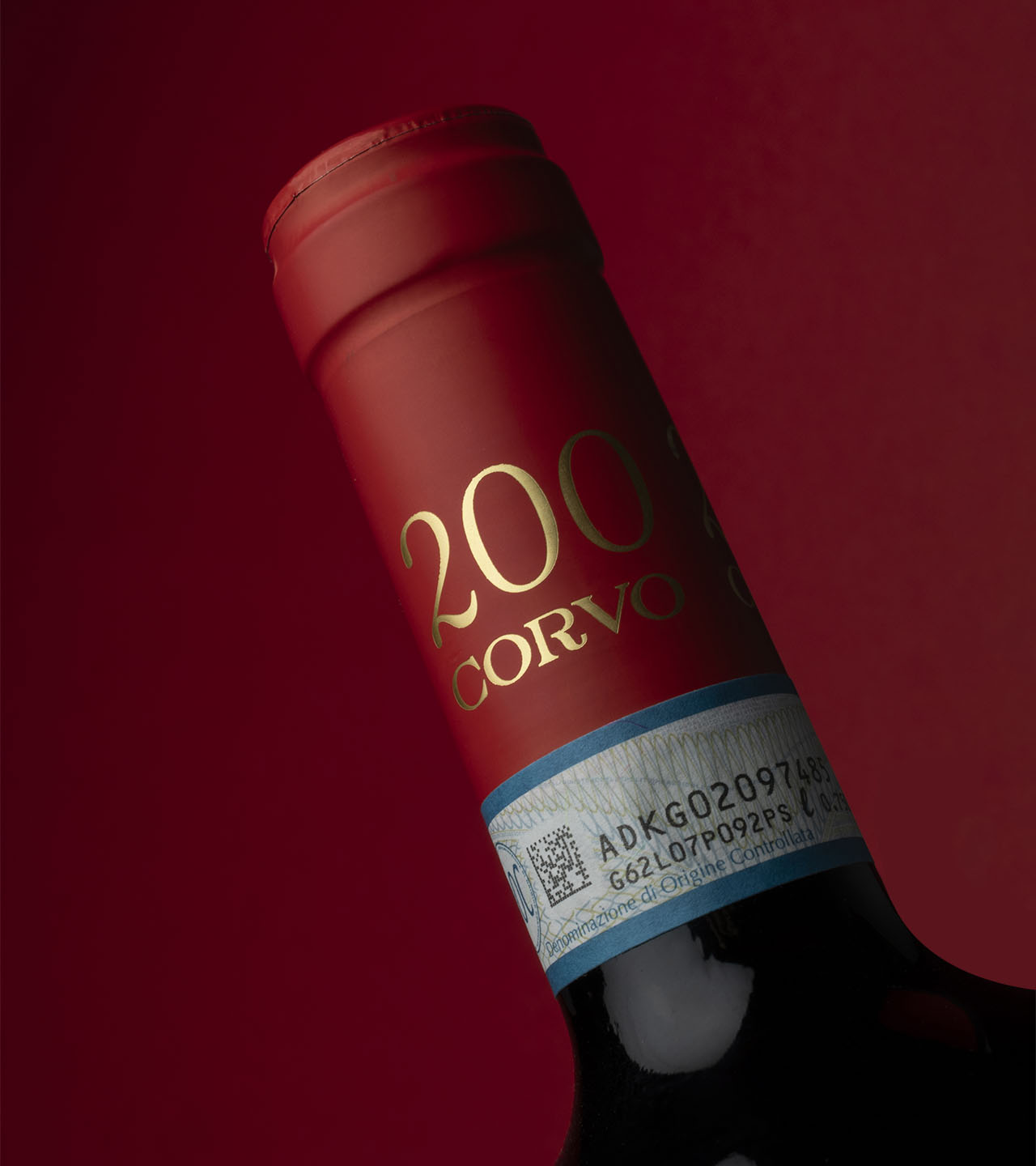
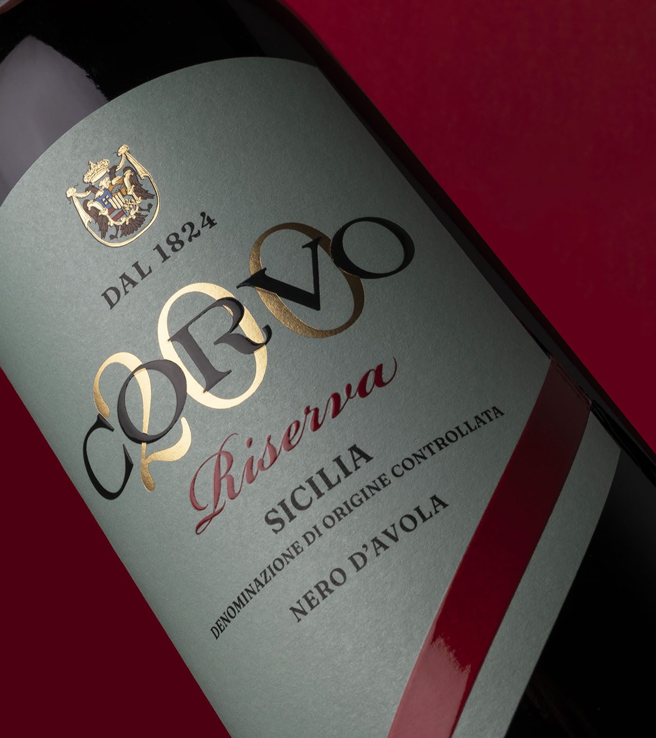
We redesigned the Corvo logo, with a stylized “R” that recalls the typography of the past, and reimagined the historic noble crest, adapting it for more functional use in the digital world. We also established a new color palette and created a company brand manual.
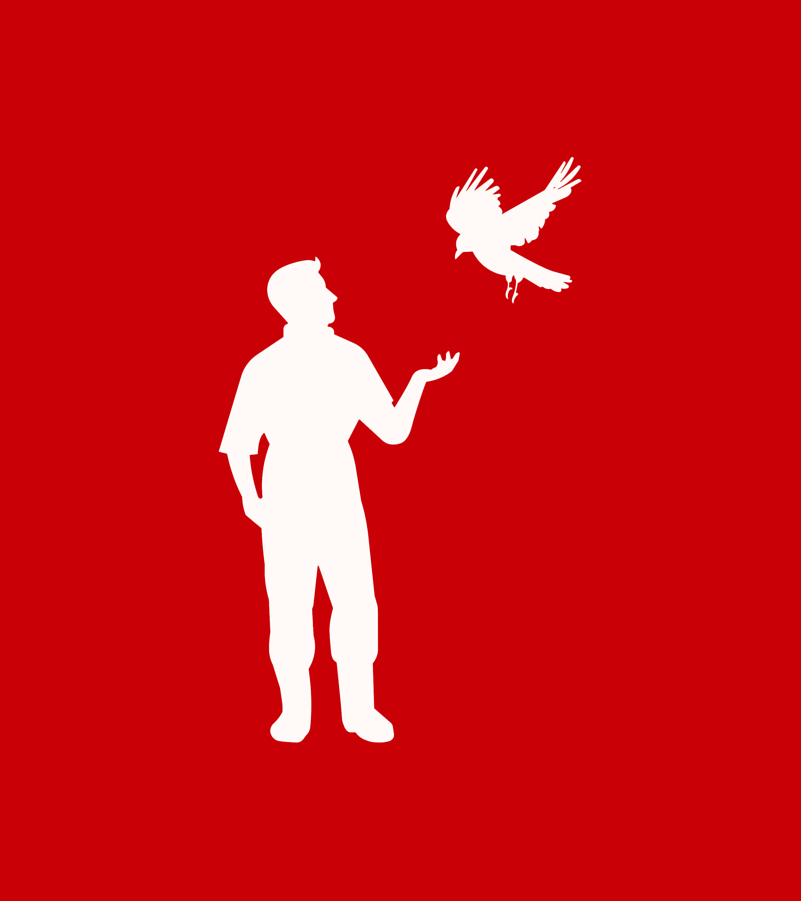
While maintaining a connection to the past, the project also introduces elements that break from tradition, creating a dreamlike world where past and present blend with fantasy. Specifically, we illustrated and told the legend of Mimmo and Peppe, the protagonists of “the pact with nature,” symbolizing the bond between man and the Corvo, which gave rise to this historic Sicilian winery.
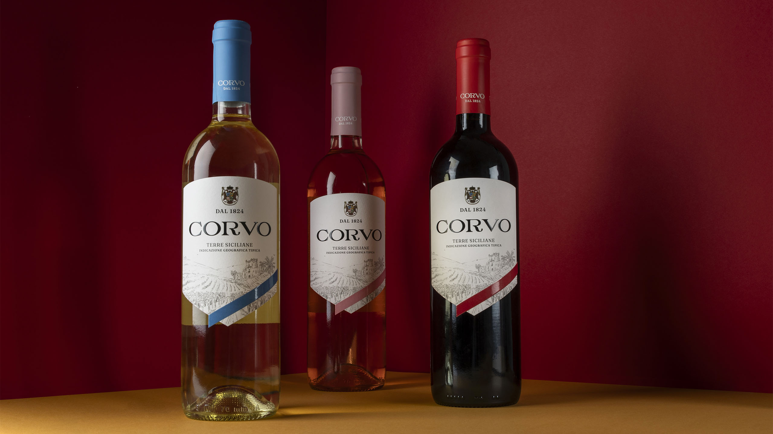
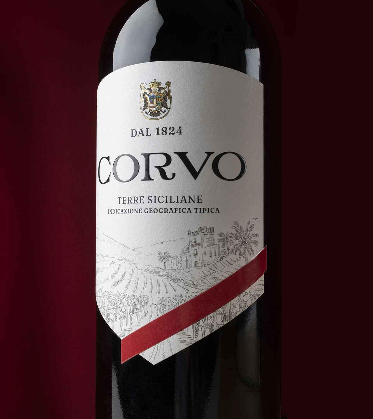
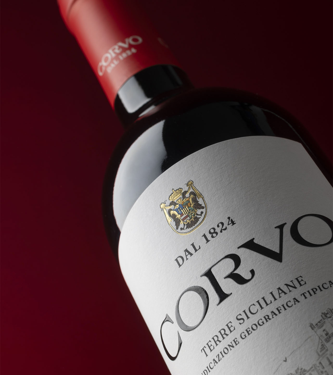
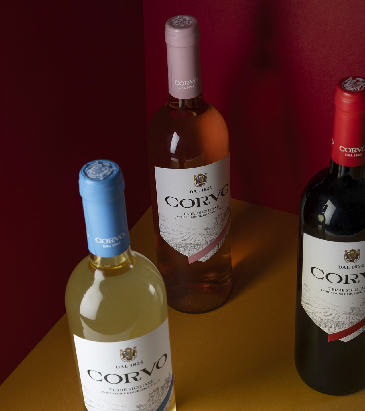
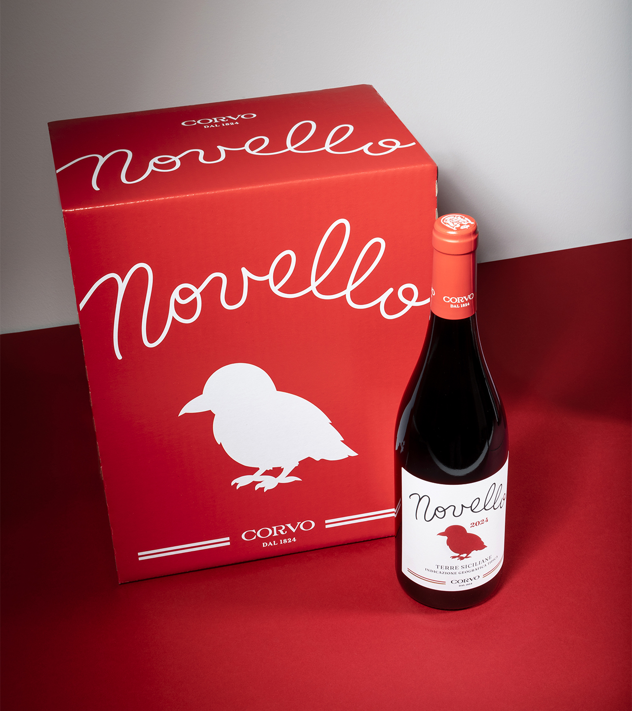
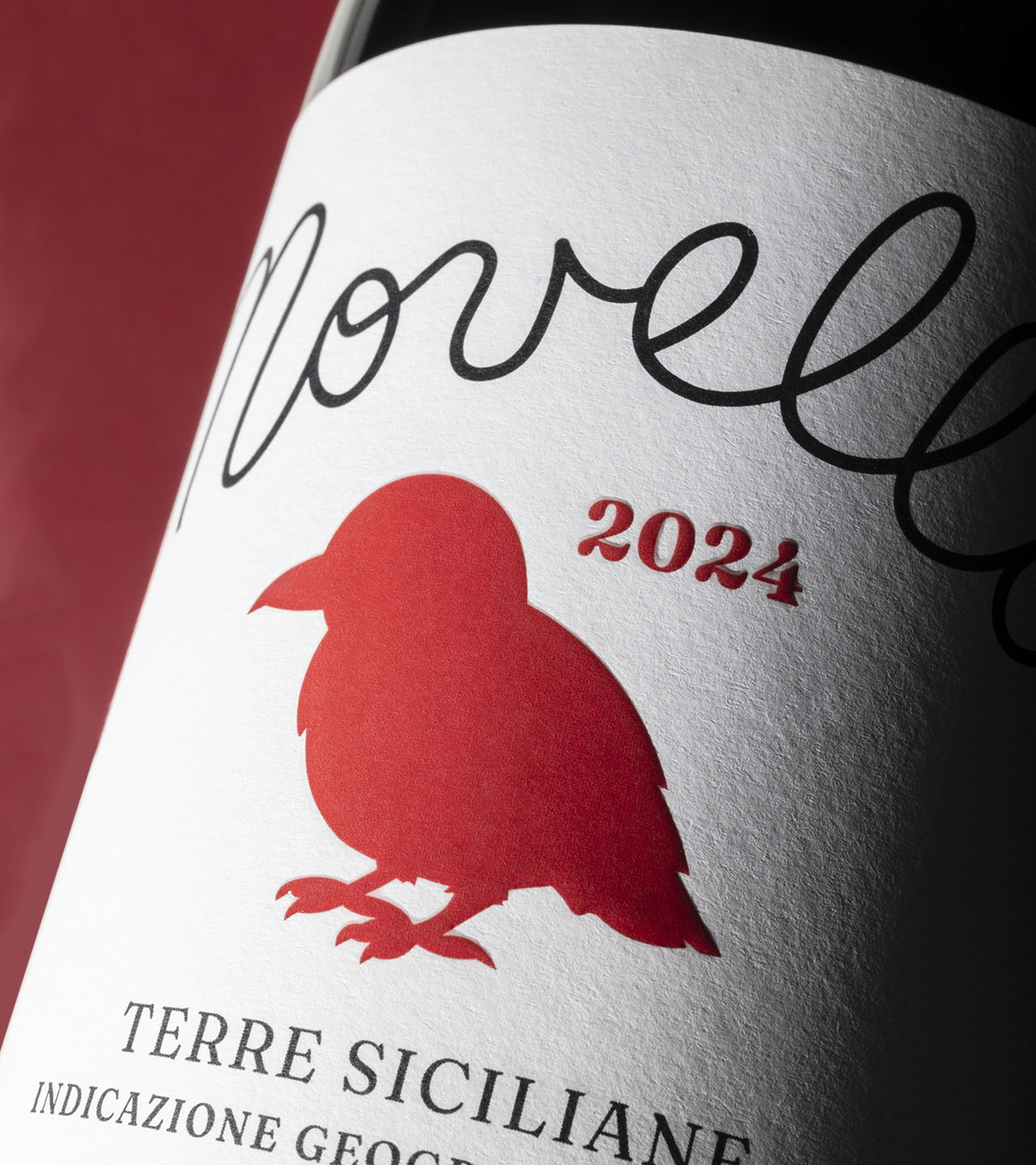
In addition to curating the visual identity, we revamped the labels of the Classici, which now, in addition to the new logo and crest, feature fresh colors for each of the three varieties and an illustration of the vineyard, the site of the meeting between Mimmo and Peppe, with the ancient Corvo castle in the background. Finally, we designed the label for the Novello, which tells the story of the birth of the little Corvo.